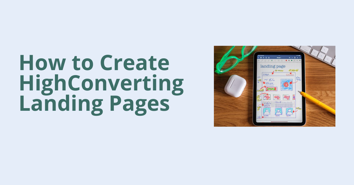
A landing page is a crucial part of any digital marketing strategy. It’s the page visitors land on after clicking an ad, email link, or social media post, and it plays a huge role in turning visitors into customers or leads. The goal of a landing page is simple: get users to take a specific action, like signing up for a newsletter, purchasing a product, or downloading a guide. But not all landing pages convert well. To ensure your landing pages deliver the results you want, there are certain strategies and best practices you can follow. This blog will guide you on how to create high-converting landing pages that attract and retain users.
1. Focus on a Single Goal: The most effective landing pages are focused on just one goal. Whether it’s getting users to sign up, download, or buy, having a clear and specific call to action (CTA) is essential. A page that tries to do too many things can confuse visitors and lower your conversion rate. Actionable Tip: Think about the action you want your visitors to take. Every element on the page from the headline to the images should work toward convincing the user to complete this one task.
2. Craft a Clear and Compelling Headline: Your headline is one of the first things people notice when they land on your page. A clear, concise headline tells visitors what they can expect from the page, and it should align with the ad or link that brought them there. For example: – If you’re offering a free eBook on digital marketing tips, a headline like “Get Your Free Digital Marketing eBook Now” clearly tells visitors what they’ll receive. – Avoid vague or overly complicated headlines that might confuse or mislead your audience.
3. Use Simple and Persuasive Copy: The text on your landing page (often called copy) should be easy to read and persuasive. Focus on the benefits of your offer, not just the features. For example, instead of saying, “Our tool has 10 features,” focus on how it helps the user, like “Save time and increase productivity with our all-in-one tool.” Keep the copy simple and to the point. Visitors should be able to scan the page quickly and understand your message.
4. Create a Strong Call to Action (CTA): The CTA is arguably the most important part of your landing page. This is the button or link that users click to take the desired action (like “Buy Now” or “Sign Up Today”). Your CTA should be clear, direct, and easy to spot. Some tips for effective CTAs: – Use action-oriented language like “Get Started,” “Download Now,” or “Claim Your Free Trial.” – Make the button stand out by using contrasting colors or large text so it’s easy to notice. – Keep the CTA short and to the point.
5. Use Visuals to Support Your Message: Images and videos can play a huge role in boosting the conversion rate of your landing page. Visual elements can capture attention and help explain your offer more effectively. For example, if you’re selling a product, use high-quality images that show the product from different angles. If you’re offering a service, a short video explaining how it works can engage users and increase trust.
6. Keep the Design Simple and Focused: A cluttered landing page can overwhelm visitors and cause them to leave without taking action. Keep the design clean and focused. White space, which is the empty space between elements, helps make the page easier to read and navigate.Focus on placing the most important information and the CTA above the fold (the top part of the page that users see without scrolling). Make sure that the design leads visitors naturally toward the CTA without too many distractions.
7. Use Social Proof for Trust: Social proof is a powerful way to increase credibility and encourage visitors to take action. This can include: – Testimonials from satisfied customers – Case studies – Ratings and reviews – Logos of well-known companies that have used your product or service When users see that others have had positive experiences, they are more likely to trust your brand and convert.
8. Keep the Forms Simple: If your landing page requires users to fill out a form (for example, to download an eBook or sign up for a trial), keep the form as short as possible. The more fields you ask users to fill out, the less likely they are to complete it. Ask only for the information you need. For example, if you’re asking visitors to sign up for a newsletter, just ask for their email address rather than requiring full name, phone number, etc.
9. Make Your Page Mobile-Friendly: With more and more users browsing the internet on their phones, it’s important to ensure your landing page is mobile-friendly. A mobile-optimized landing page should load quickly, be easy to navigate on smaller screens, and have buttons and forms that are easy to click or fill out.Use responsive design techniques so that your landing page adjusts to different screen sizes seamlessly.
10. Test and Optimize Regularly: Finally, remember that creating a high-converting landing page is an ongoing process. A/B testing allows you to compare two different versions of your landing page to see which one performs better. You can test different headlines, CTAs, images, or even the page layout to find the most effective combination. Regular testing helps you improve the performance of your landing pages and increase conversions over time.
Conclusion: Creating a high-converting landing page doesn’t have to be complicated. By focusing on a clear goal, using persuasive copy, designing a clean layout, and including a strong call to action, you can increase the likelihood of turning visitors into customers. Keep testing and optimizing your landing pages, and you’ll see improved conversion rates that lead to better results for your business.


